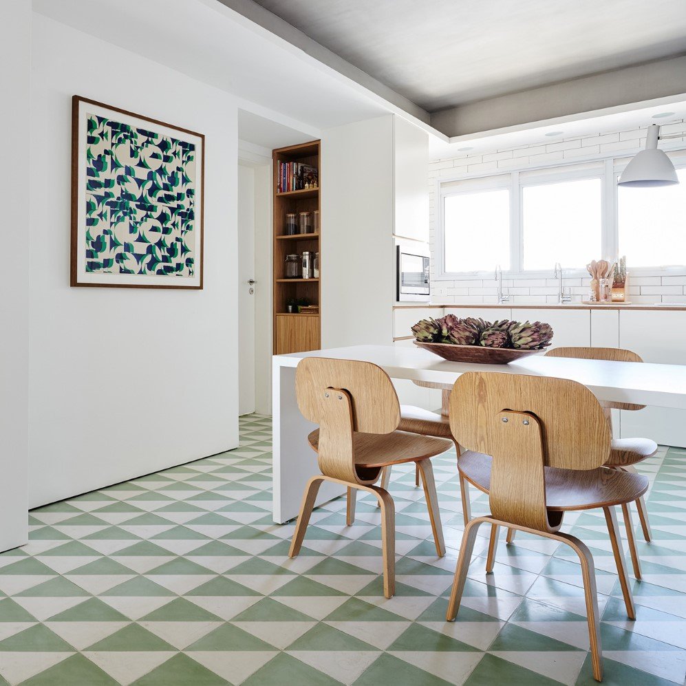
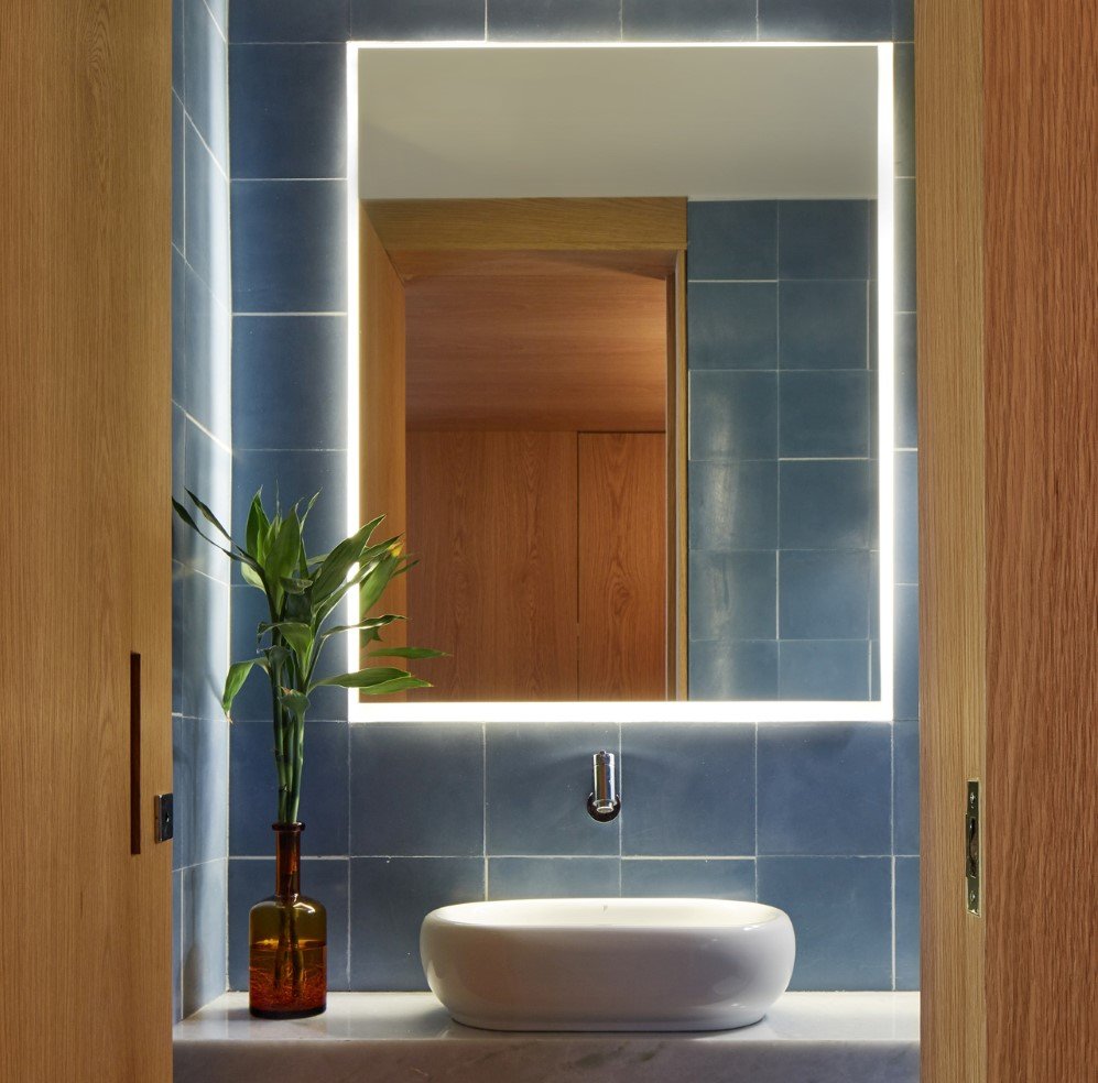
Bold patterns and graphic tiles add life to this contemporary apartment
The minimalism trend is surely getting a lot of attention these days, especially when it comes to the architecture and interiors of city apartments. However, this trend has reduced every single contemporary house to a living space with bland colour palette. David Ito Arquitetura, an architectural firm from São Paulo, Brazil has though proved how modern architecture can look superbly beautiful when combined with interesting bold patterns and vivid colours.
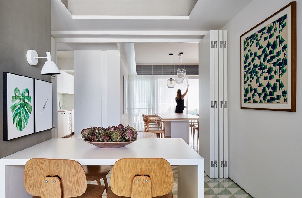
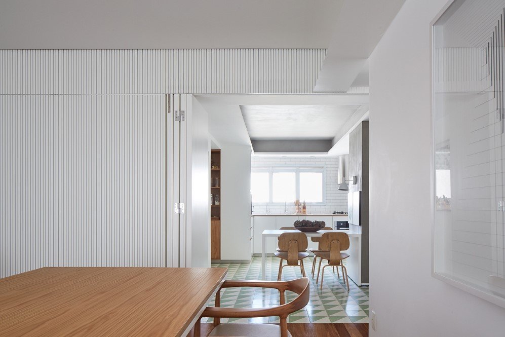
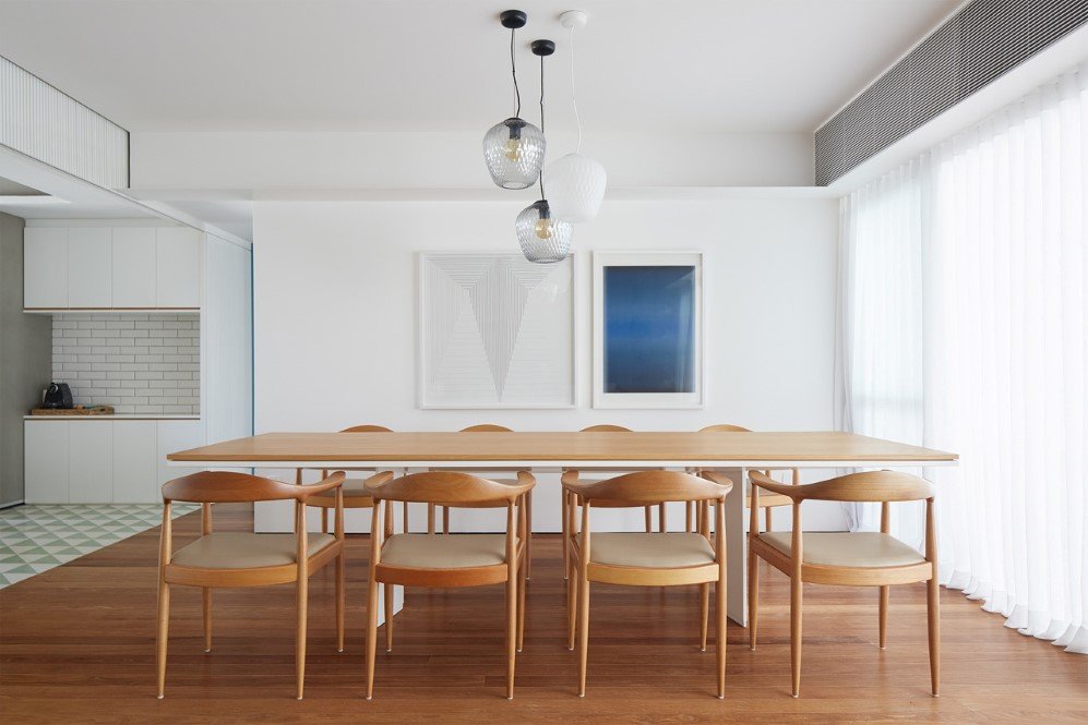
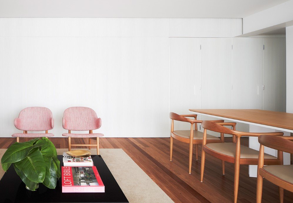
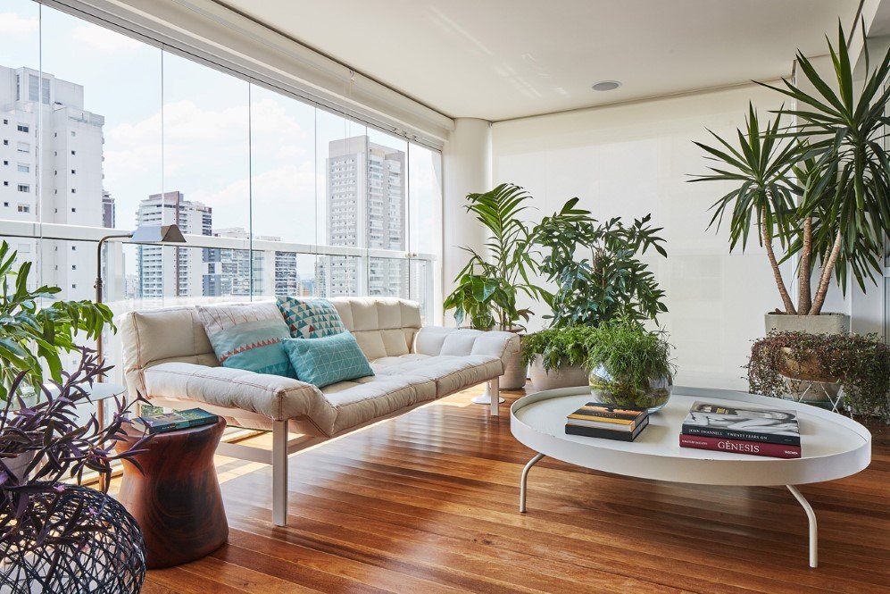
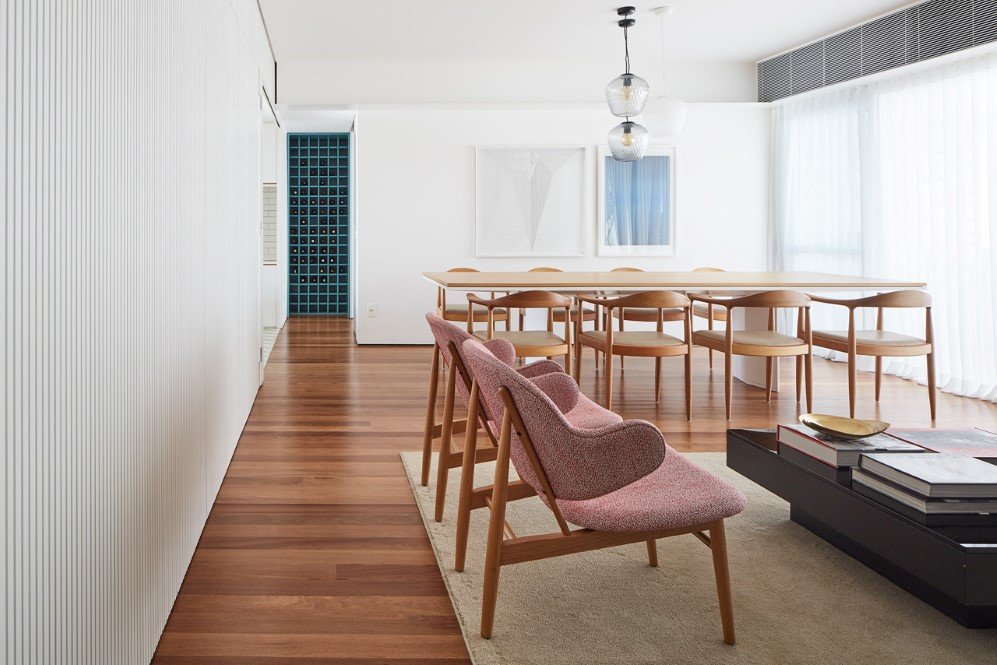
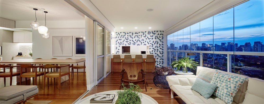
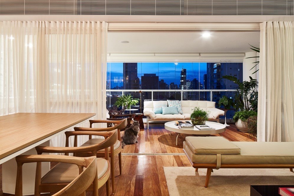
The 260-square-meter home has quite a luxurious floor plan with a sunroom, an airy living room, kitchen, bedrooms and an expansive dining and lounge area which can be separated with the help of light curtains to maintain privacy.
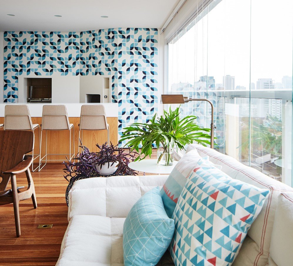
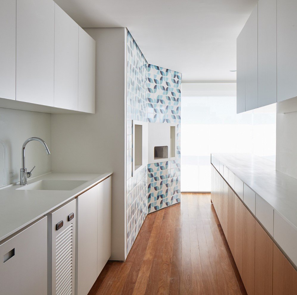
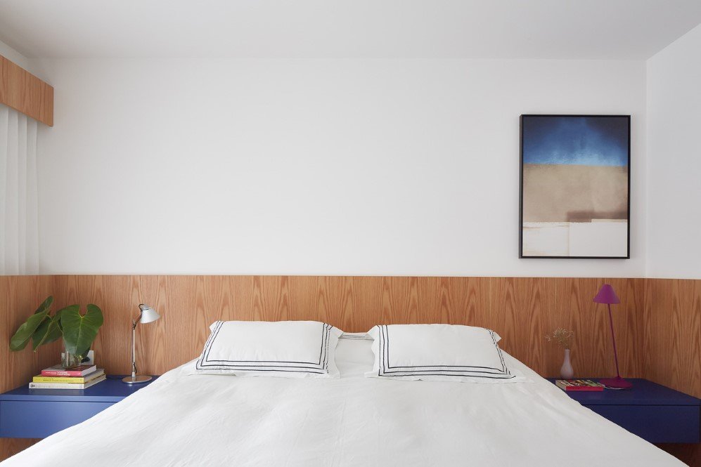
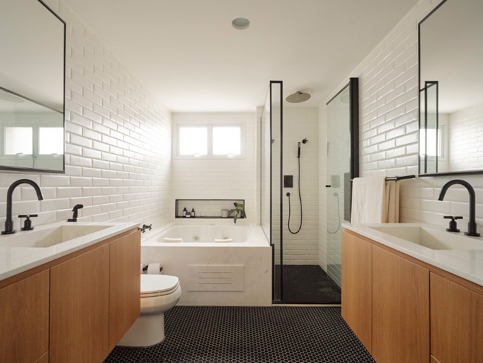
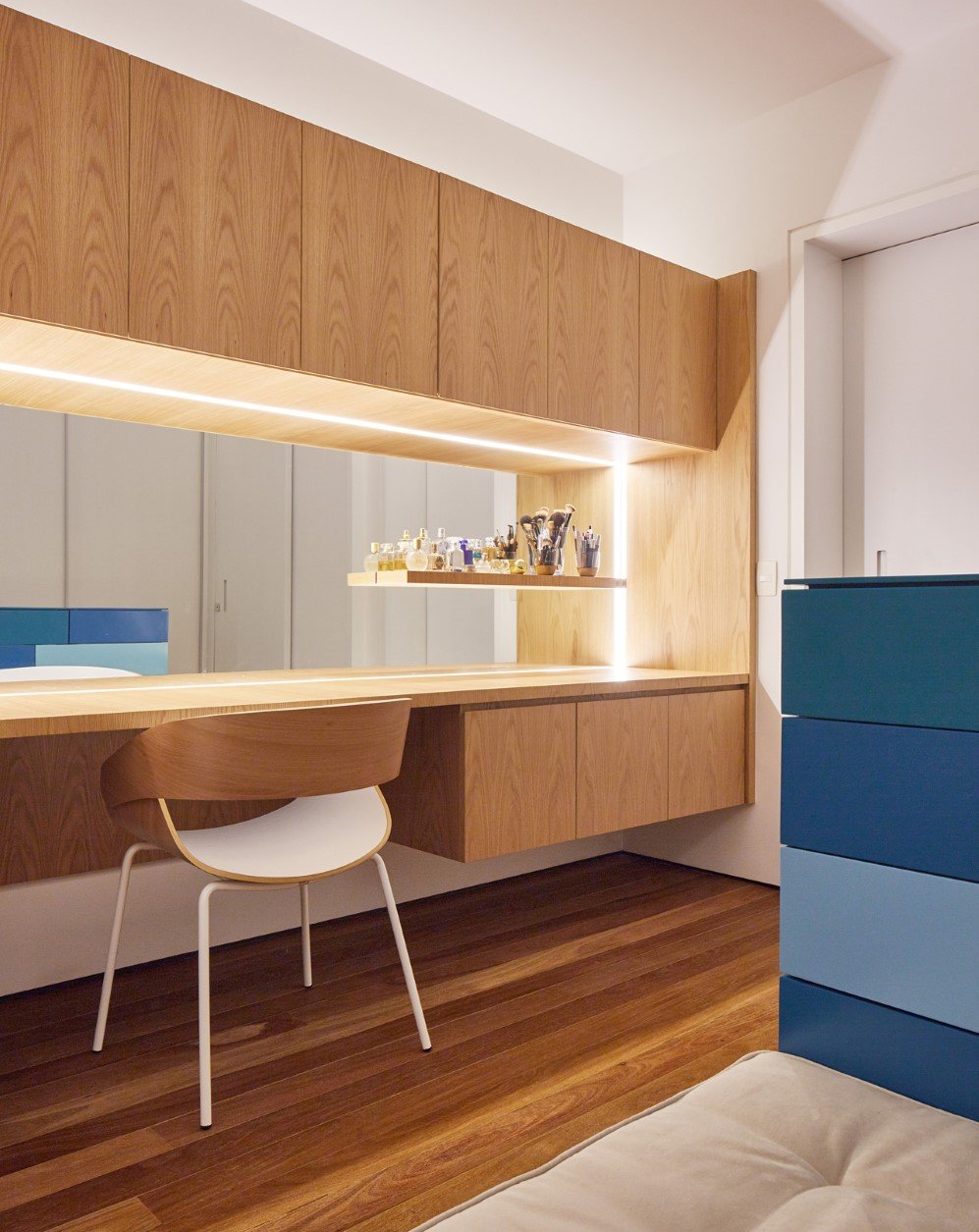
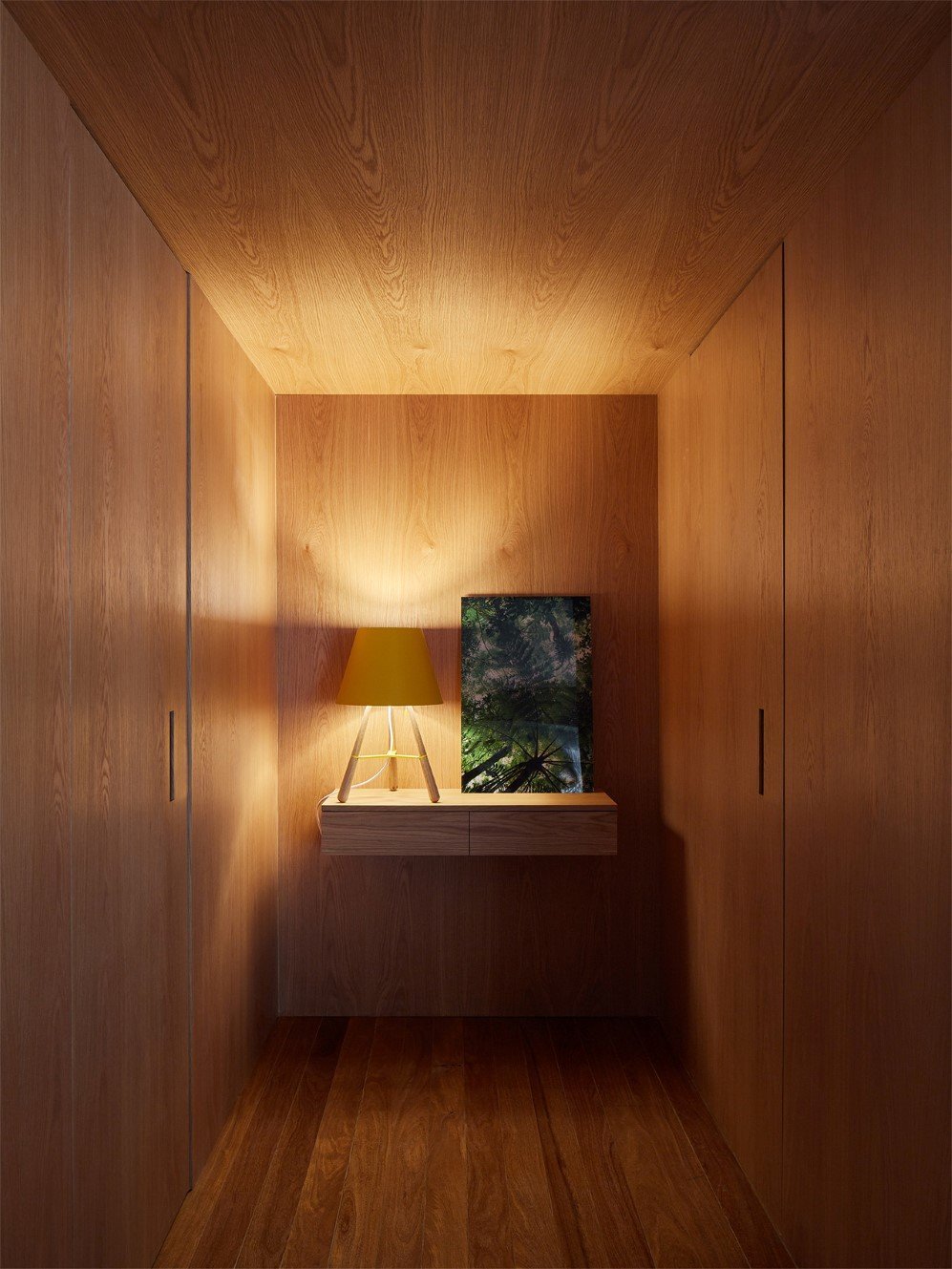
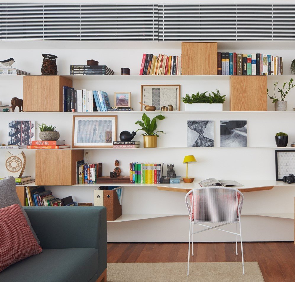
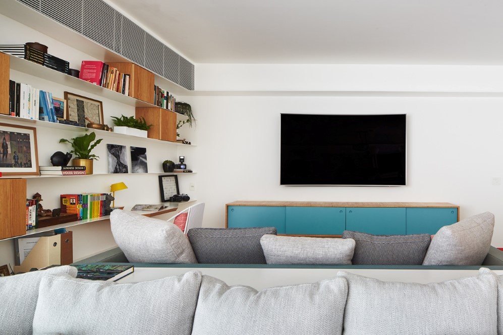
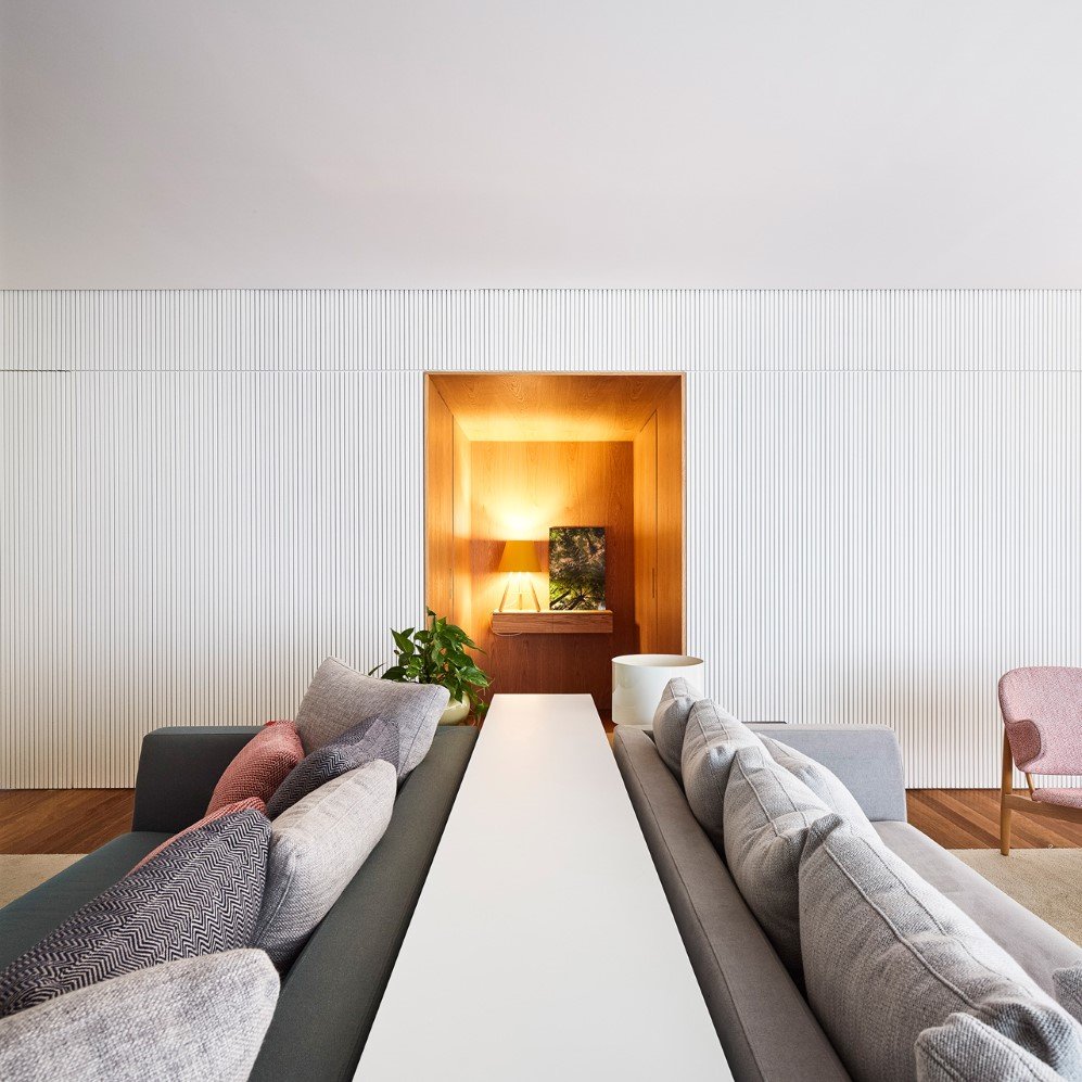
The bold patterns and graphic tiles give a nice contrast against the plain walls and light wooden built-in furniture of the apartment while the floor-to-ceiling high glass windows makes the interior glow with warm daylight. David Ito Arquitetura has set a new bar in the world of contemporary architecture with this apartment and it sure is too high above to be reached by any other firm any time soon.
All Images: © Pedro Kok via Design Milk
Architects: David Ito Arquitetura
h/t: Design Milk
