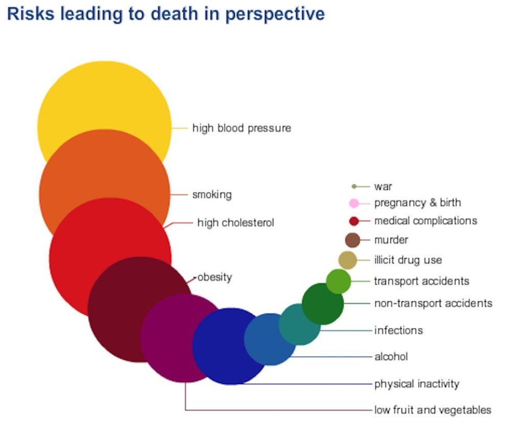
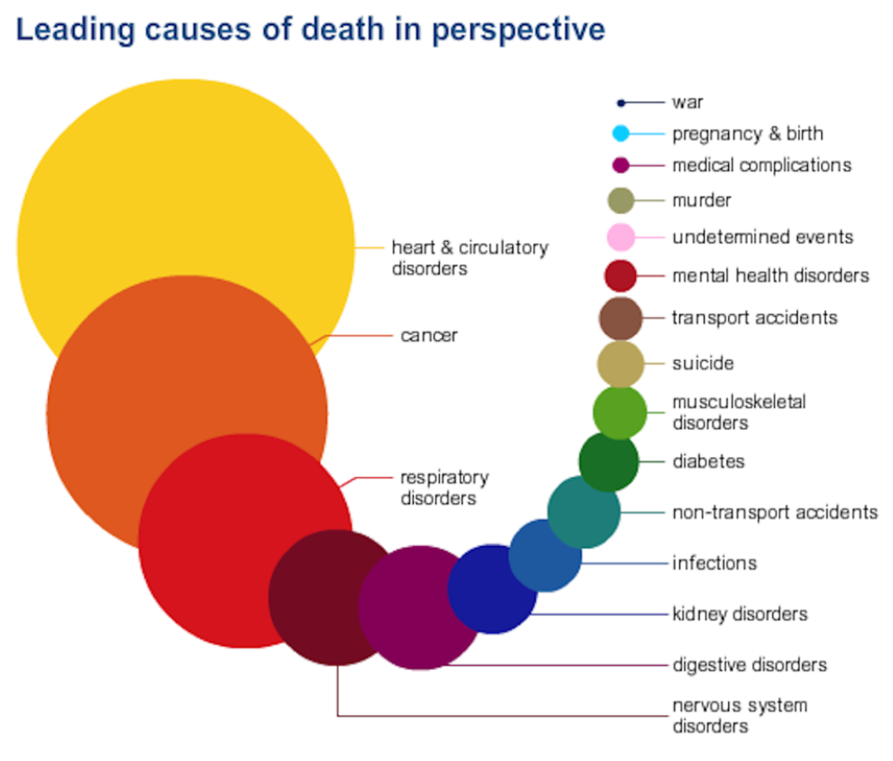
Check out this insightful infographic to know the top risks that might kill you

Human are always nervous about the oddest things when it comes to the threat of losing their lives and more than often, these fears are so baseless that they seem to be more inclined towards superstitions. To clear the air, UK’s National Health Service has put together an infographic which is called, Atlas of Risk which shows the leading causes of death in the UK. The infographic has really put the risks associated to death in perspective since it shows that the chances to die due to contracting heart diseases is way more than the odds to die in a terrorist attack.
NHS gave a clear statement on their website to convey the concept behind sharing Atlas of Risk. “It’s easy to lose perspective and worry about small or insignificant risks while ignoring, or being unaware, of the major threats. The NHS Choices Atlas of Risk has been designed to help put health threats into perspective.”
Check out the inforgraphic right below!
Images: © National Health Service
h/t: Business Insider

