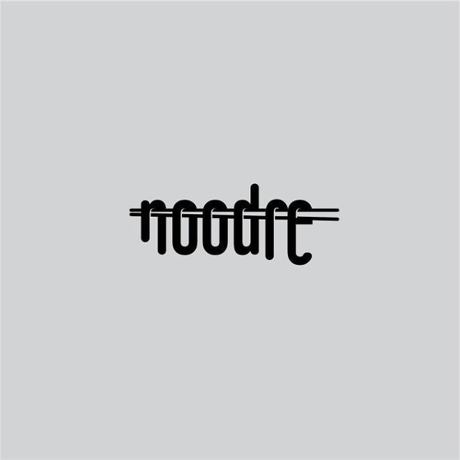
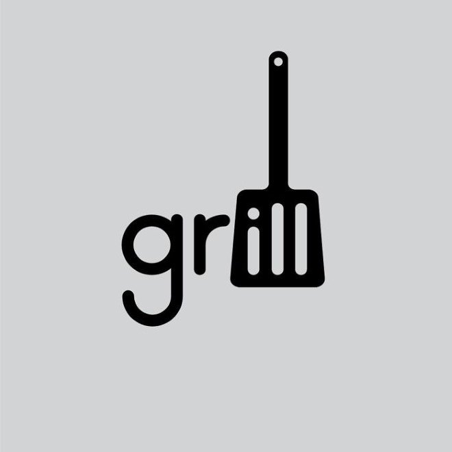
Try making sense of these simple yet quirky logo designs created by Daniel Carimatz!

Logos undoubtedly play a vital role in representing the product or a service however, ever wondered how meaningful the logos might look if the visuals of quirky company names are made to incorporate in them? Thanks to Swedish designer Daniel Carlmatz, we do not need to imagine a lot.
The designer challenged himself to play around with the words by incorporating visual elements in them or just by creating negative spaces. The simplicity of the design gives the margin for light-hearted quirkiness however, it might take you some time to figure out a connection between the word and the visual component.
“I didn’t want them to take up too much of my time so I used to do them in my head or sketch them down on my way to work, and then finalize them on my way home from work. But sometimes you just end up with nothing,” the designer shared his creative process. “I had a few words I felt I wanted to do, but a lot of the ideas came from having a solution first – and trying to find a suitable word that could support it. One of the hardest words was Panda, which was with me from day one, but wasn’t published until day 251.”
Images: © Daniel Carimatz
Reference Links: Bored Panda , Demilked


