How to use Pivot Table in Google Sheets Easily and Correctly!
 Image Source: Google
Contents
What is a Pivot Table in Google Sheets Tool?
The pivot table in google sheets function, to put in simple words, is for the utilization of tables to summarize extensive google sheets data. Pivot tables are undoubtedly one of the most beneficial google sheets tools that make data organization easier and interpretation of tasks much simpler. These provide the reader with valuable insights without making them to read through detailed data, thereby making hefty data look like simple data sets.
For example, picture some data with a number of values against repeated categories. You want to aggregate your data for each category as well as to have a total of the entirety of your values. A pivot table is going to do exactly that for you without making you write extensive formulas and be constantly updating them.
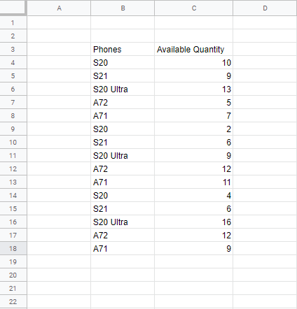
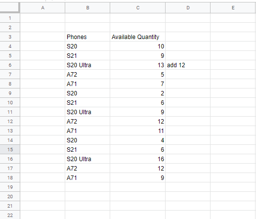
An example of this type of data can be seen below. This is the data from a phone store. It shows the names of all available phones alongside the quantities they are present in. This data is raw and unorganized, thus, the repeated categories.
Why use a Pivot Table in Google Sheets Tool?
With the number of data organization and summarization techniques google sheets offers, one would certainly wonder why they would need to add another tool to the list. The answer, however, is very simple.
Pivot table in google sheets tool offers a great deal in terms of efficiency. It is simple, quick, and versatile. This tool helps to organize the data without making it look overdone, even if you have thousands of rows and columns. The best thing about pivot tables is that they automatically update data from the sheet to the table; you can edit values on your data table or sheet, and your pivot table will be updated.
We will go through the entire working process on how to use pivot tables in google sheets easily and effectively in this step-by-step guide.
Step-by-Step Guide on how to Use Pivot Table in Google Sheets
Constructing a pivot table is as simple and easy as it gets. With no typing of words or excessive clicking of the mouse button, the process is super easy and quick.
To describe the step-by-step process, let us take the same example as discussed above.
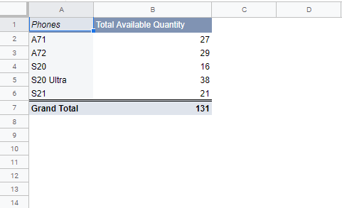
To organize this data in such a way that we are left with those rows only with the individual names of the phone models alongside their total available quantity, we are going to use the pivot table in google sheets tool.
Here’s how you can construct one.
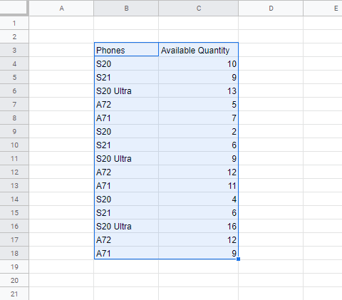
Step 1: To start off, select your entire information table.
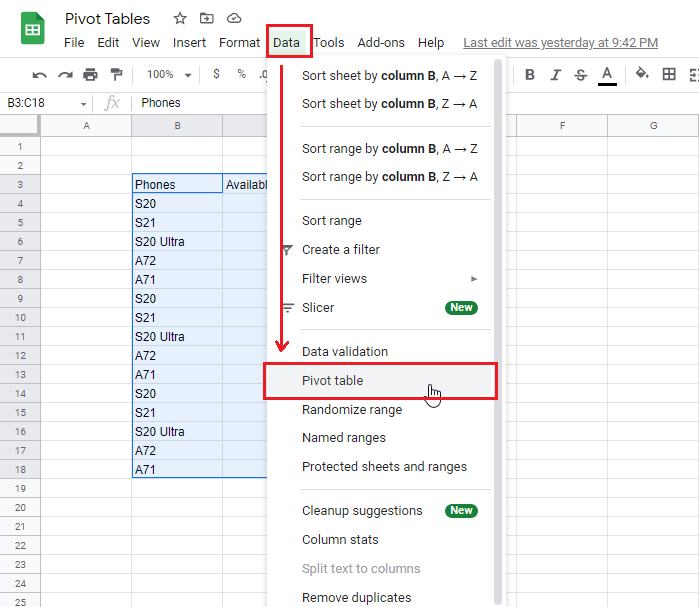
Step 2: In the menu bar, go to “Data”, and then to “Pivot table”.
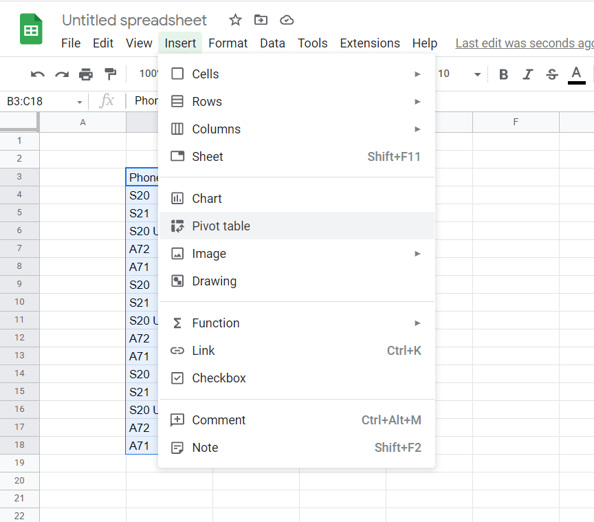
For some versions of the google sheets application, you can find the “Pivot table” option by clicking on “Insert“.
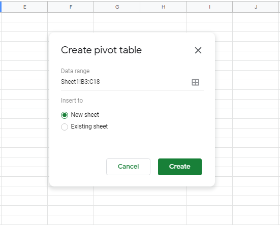
Clicking on “Pivot Table” will result in a pop-up (screenshot below) in the center of the window. You don’t need to change the “Data Range” as we have already selected it. If you had not originally highlighted your data, you could have entered it manually here.
You can choose to get your pivot table drawn on the same original spreadsheet or on a new one. The new one will be a regular spreadsheet just without the cells’ borders and will contain only your new pivot table.
Step 3: For this example, let’s go with employing the pivot table in google sheets tool in a new spreadsheet, thus, we have selected the “New Sheet” option.
Step 4: After that, you have to click “Create”.
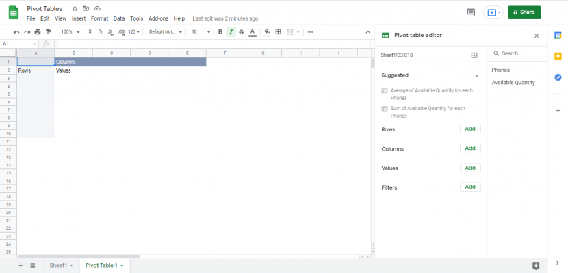
Once you click “Create”, a rough incomplete sketch of your pivot table gets constructed, with a number of customization options as part of the pivot table editor window on the right of the screen. This outline or the initial pivot table draft defines certain values like ”Columns” as the Column label, ”Rows” as the row label, and ”Values” to represent where the values will be added. It acts as a skeleton for your pivot table which you will now fully construct and customize.
To fill in this table you are going to use the options shown on the right side of the screen.
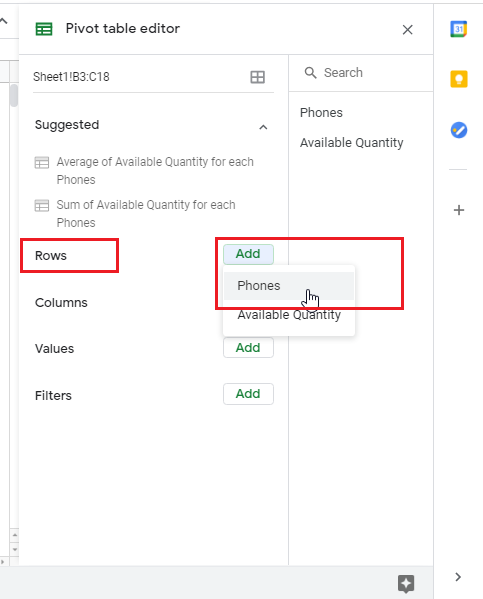
Step 5: Since the goal here is to formulate a table with the names of the phone models available in a store alongside the quantity of phones side-by-side in the form of a row, you will have to go to “Rows”, and then select “Phones”.
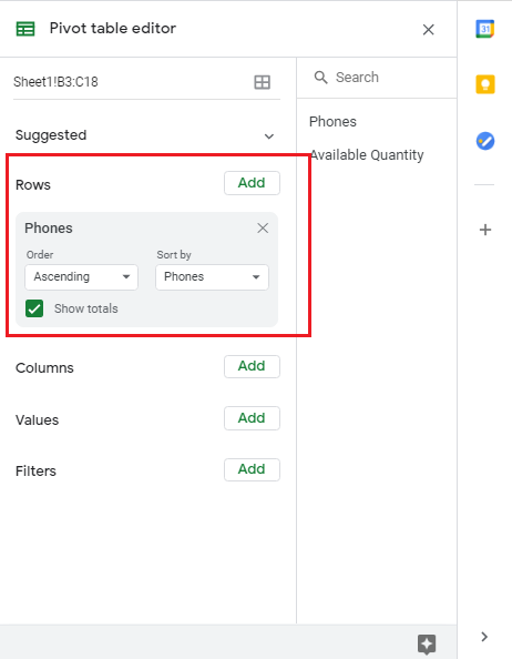
Step 6: Some new options will now pop up indicating the default order and arrangement of your data lists and allowing you to make any changes according to your desires.
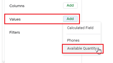
Step 7: Now, for the next step, which is to include our phones’ corresponding available quantities in the pivot table, you have to go to the section titled “Values”, and click “Add”. From the available options, click on “Available Quantity”
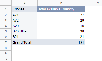
This is what the table will look like now.
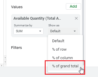
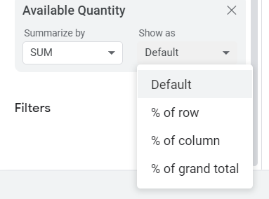
Step 8 (Optional): You can also set up percentages in the “Available Quantity” section. This can be done by going back to the Values section in the pivot table editor. Here click on “Show as”, and then on “% of grand total”.
Performing this action will tell you the percentage of each specific phone model available out of all the available models.
And with that, your pivot table has been fully customized with all the information that was needed. The other available sections can be used according to your specific data, whatever looks best for the type of data you are dealing with.
For example, setting up the “Columns” section instead of “Rows” that we did in this example, can be done for data that is defined by more variables, and for which you need more than two columns.
Similarly, “Filters” help you pick and choose which of your data values you want or do not want in your pivot table. The pivot table has all customizable headings and you can edit them by simply double-clicking on them. This goes for both column, and row headings.
Pivot Table in Google Sheets Tips
Here are a few tips and tricks you can follow to better understand the pivot table in google sheets tool.
1. Explanations and Cell Details:
If you want to understand the details of certain values of your pivot table, simply double click on individual cells to get the table details for them, in a separate sheet. These details explain why and how google sheets reached the value in that particular cell.
2. Suggested Pivot Tables:
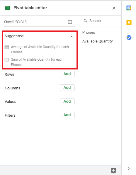
When you’re in a hurry, google sheets offers suggested formats for pivot tables based on your specific data set.
This option shows up on the top in the pivot table editor, right when you create the table.
Issues with Updating / Refreshing Pivot Table Data
As discussed before, google sheets’ pivot table updates itself from your selected data area automatically. However, sometimes it may not refresh automatically due to certain reasons. Some of these reasons include:
1. Going Outside the Selected Pivot Table Region:
Your table is not going to get updated if you update values in a region that you have not selected for your pivot table. For example, in our initial table, we selected the region !B3:C18. Now, if we add a value in an adjacent row (not part of the highlighted portion) it is not going to be considered in our pivot table.
And the pivot table will stay the same as before.
2. Use of Pivot Table Filters:
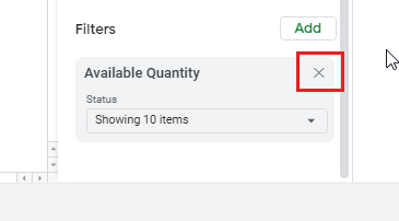
Filters are another potential reason why your table might not be getting updated. In order to fix this issue, you just need to delete your filter settings from the pivot table editor by clicking on the crosses next to your filters.
You can try filtering again afterwards if that is the requirement of your document.
3. Using Functions that need to be Refreshed First:
Using specific functions like TODAY, RANDOM, etc. in your original worksheet will also be a hurdle in the automatic update of your pivot table. In such a case you’ll have to manually refresh your functions and then go to the pivot table editor again, or you could use cloud pivot tables that would refresh your functions and tables automatically.
Features and Fundamentals of Google Sheets’ Pivot Table
The pivot table in google sheets tool offers a number of customization options for your data representation. These include order, sort by, show as, summarize and filter options under each value you add in the pivot table editor. Minor tweaks in these settings can play a major role in the way your data is displayed.
1. Order:
This option is only for rows and columns and allows users to arrange their main rows and columns in alphabetical and/or numerical ascending or descending order, judging from the first character of cell content.
2. Sort By:
“Sort By” considers the data corresponding to each cell, and sorts the main row or column according to this corresponding data. The sort options can be tested for each variable before selecting one.
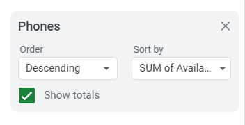
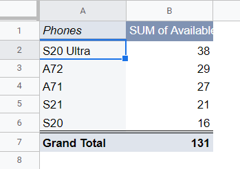
Here, we have changed the order of the data to a descending order and have sorted it by the total sum of available quantities.
3. Summarize By:
“Summarize By” offers a drop-down list with function options based on different aggregation types to apply to your selected data and then aggregate it. You can pick and choose functions according to your specific type of project or data.
To browse through other available “Summarize by” options, you have to click on the arrow button next to “SUM”.
These aggregation types you can select from are mentioned here:
SUM: Adds all the individual values of the selected cells, and displays the sum. It is only applicable to numerical data.
COUNTA: Counts the number of cells, and not the values in the cells. This option works for both alphabetical and numerical data. It does not count blank cells.
COUNT: Counts the values of cells in a defined range. This works for numerical data only and also does not count blank cells.
COUNTUNIQUE: Countunique counts the number of unique values in a defined range of cells.
AVERAGE: Calculates out the average of the values in cells in a range.
MAX: Returns the maximum value after scanning the values in the cells in a specific range of cells.
MIN: Returns the minimum value after scanning the values in the cells in a specific range.
MEDIAN: Scans the values in the cells in a range and then returns the median of those values in any empty chosen cell.
PRODUCT: Calculates the product of values of cells, as it multiplies them all in a series.
STDEV: Calculates the standard deviation of the values in cells in a range and displays this value in a newly selected cell.
STDEVP: Also calculates out the standard deviation of the values in cells in a range. This one is used for larger data sets of the entire population (not a sample).
VAR: Calculates the variance of the values in cells in a range and displays this result in a different selected cell.
VARP: Calculates the variance of the values in cells in ranges that are larger and for entire populations. It takes the total sum of squares of the deviations of each cell’s value from the mean and then divides them by the number of values.
4. Show As:
“Show As” is also only for values inside cells and determines the way the final table is represented e.g., as whole numbers, or as percentages of rows, columns, or grand totals.
5. Filters:
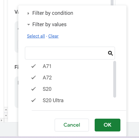
Just like the other discussed functions and arrangement options, filters help you to select and choose data that will be on the table. When you turn on filters you get a list of all your cells’ values that you can choose to keep in or remove from your pivot table and its calculations.
They will also allow you to specify the kind of values you want to be displayed on the final pivot table in google sheets tool.
For example, we can filter the “Phones” list by model name, values or conditions.
Formatting Pivot Tables in Google Sheets
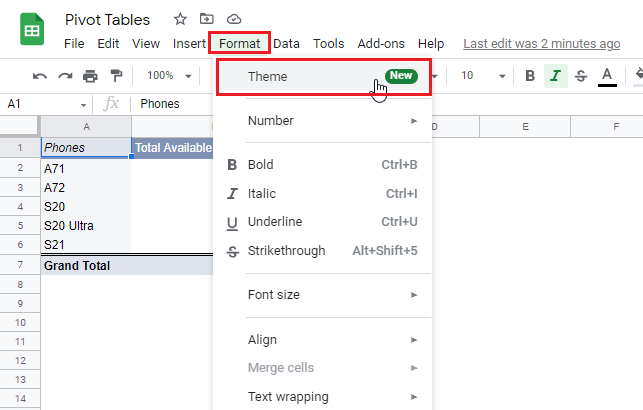
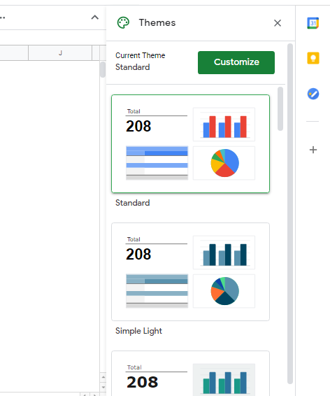
Step 1: In order to format your pivot table for visually customized views, all you need to do is to select any cell on your table and go to the “Format” option in the menu bar above. From the drop-down menu that pops up, you have to select “Theme”.
Step 2: From here, on the right side of your screen a series of themes will appear. These themes are the same as those for the graph or chart type picker.
Step 3: Click on these themes to preview them and find one you like for your pivot table.
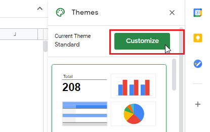
If you don’t fancy one of these, there is still the option to customize the visuals of your pivot table. This option is useful for people wanting a little creative freedom.
Step 4: For this, you need to click on “Customize”.
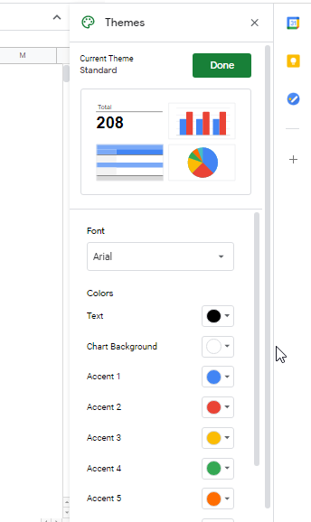
Clicking on “Customize” will give you the list of all choices that can be made by you, these include the fonts, and colors. Formatting with more professional colors and fonts in mind makes your insights look much more presentable and also, gives off a more individual and unique touch.
You can play with these options, practice, perfect your skills and get to the level you like, thus, fully optimizing the pivot table in google sheets tool.
